

Responsive Design
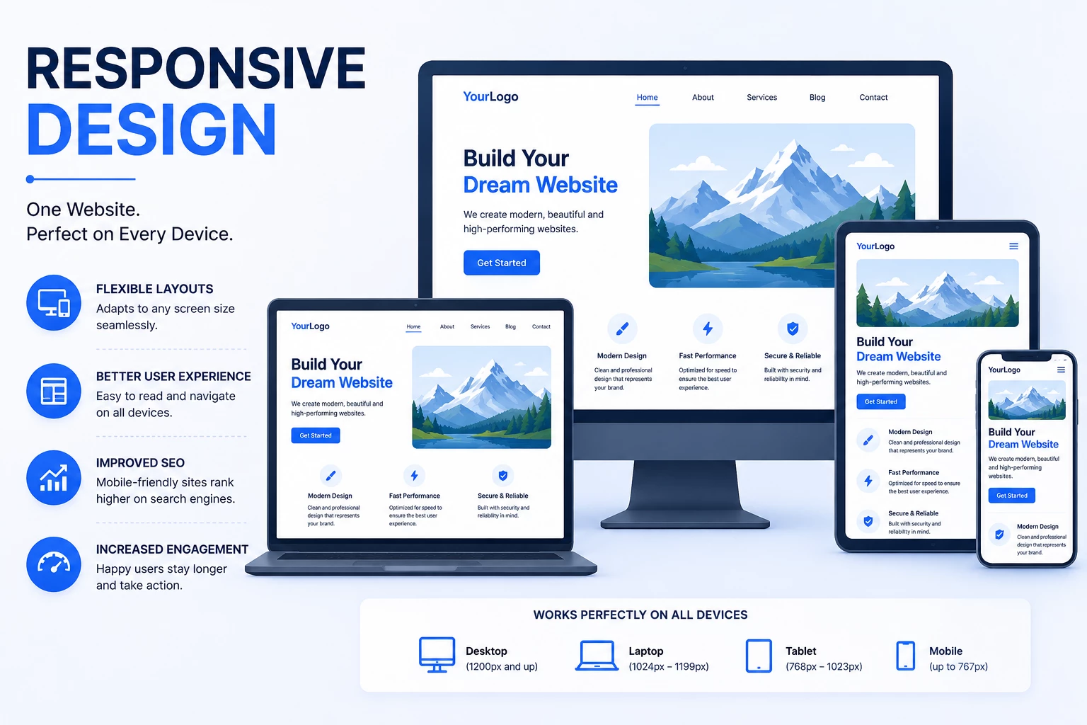
Create a seamless user experience across all devices with professional responsive web design services. I build fully responsive websites that automatically adapt to desktops, laptops, tablets, and mobile devices while maintaining performance, usability, and visual consistency.
Whether you are using WordPress, Shopify, Wix, or a custom website, I ensure your website looks professional and functions smoothly on every screen size and browser.
Why Responsive Design Matters
Modern users browse websites from multiple devices with different screen sizes and resolutions. A non-responsive website can create layout issues, poor user experience, and lower search engine rankings.
Responsive design helps improve accessibility, engagement, mobile usability, and overall website performance while creating a consistent experience for every visitor.
My Responsive Design Services
1. Mobile-Friendly Website Development
I create websites optimized for mobile devices to ensure smooth navigation, readability, and functionality on smaller screens.
2. Responsive Layout Design
I build flexible layouts that automatically adjust to different screen sizes and resolutions without breaking the design structure.
3. Cross-Browser Compatibility
I ensure websites work properly across modern browsers including Chrome, Firefox, Safari, Edge, and mobile browsers.
4. Responsive UI/UX Optimization
I optimize spacing, typography, navigation menus, buttons, and user interface elements for better usability on all devices.
5. Tablet & Desktop Optimization
I carefully optimize websites for tablets, laptops, and large desktop screens to maintain a balanced and professional appearance.
6. Performance Optimization for Mobile
I improve mobile loading speed and responsiveness to create faster browsing experiences and better Core Web Vitals.
7. Responsive eCommerce Design
I develop responsive online stores with optimized product pages, carts, and checkout experiences for mobile shoppers.
8. Testing & Device Compatibility
I test websites across multiple devices, screen sizes, and resolutions to ensure consistent performance and functionality.
Benefits of Responsive Design
- Better user experience across all devices
- Mobile-friendly website performance
- Improved search engine rankings
- Faster and smoother navigation
- Increased user engagement and conversions
- Better accessibility and usability
- Consistent design across devices and browsers
- Improved mobile SEO performance
My Responsive Design Process
- Analyze website structure and user experience
- Design flexible and responsive layouts
- Optimize typography, images, and UI elements
- Improve mobile navigation and functionality
- Test responsiveness across devices and browsers
- Optimize speed and performance for mobile users
- Deliver a fully responsive website experience
Technologies & Tools
I work with HTML5, CSS3, Flexbox, CSS Grid, JavaScript, Bootstrap, Tailwind CSS, responsive frameworks, Chrome DevTools, and modern front-end development techniques to build responsive and scalable websites.
Let’s Make Your Website Fully Responsive
If your website is not optimized for mobile devices or different screen sizes, I can help create a responsive and user-friendly experience tailored to modern web standards. My focus is on building visually consistent, fast, and responsive websites that improve usability, engagement, and business growth.